getting down to the concept art
I've done a bit of work on the road safety film today, but my focus has been on the diorama project (i refuse to call it NtROPy, I hate leet speak and I hate pompus puns). Sorry, but I have to use the right language again.. but don't worry, there's some nice new pictures at the end.
Dev Diary : Day 3 - 09/02/2006
An impromptou meeting and the resulting sketches
Had a lecture today with Barry, which had the bonus of collecting 4 of the design guys on the project, who between us represented 3 of the 4 groups. Jules called a meeting (which he has always been a fan of doing, and we gathered in the bar with my sketchbook and a pile of ideas). Our goal was to try to build up some shared designs between us, so as to create consistency and to push forward the design elements which all 4 projects share. With that in mind people spoke as I sketched. The final results (with additional wacom colouring) are at the end of the post.
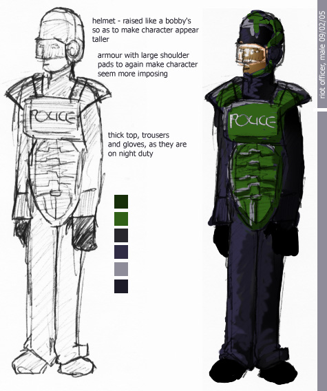
The first issue was that of the riot police costume. Most of the guys there had a pretty good idea of how modern day teams dressed. Most of the sketches I'd done so far were either the combine from HL2, or Fatman from MGS2.. it wasn't that I was plagerising, it was just that I was following the same design trajectory as previous design teams (something I'm reasonably proud of actually, as both games feature great character design). In conversation though the group felt the need to 'Brit-up' the riot gear, so the helmet was raised to resemble a bobby's helmet, and the green colour was added so as to make the characters slightly more militaristic. The idea of glow in the dark gear was raised, but that didn't make it into these sketches.
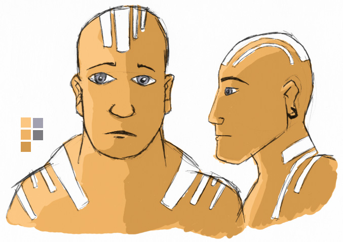
The other key job was the priests. My designs for the protestor's being in average joe costumes were liked, but the head dress I designed felt against the religious dogma of the priests, as they were all about individual freedom and liberation. Therefore more face had to be visible. A simple, messiah like, character was arrived upon. He would wear simple hand made clothes, forgoing technology. Another key change was to alter the red colour to white. This was felt by several of the guys to be more representative of the pure, individualistic nature of the group. The bright white light that they would see on being removed from the world which they did not believe. The facepaint represents this colour, but the lines also make the link to the barcode shape, which also has societal connotations. It would be rough, as if applied with the outstretched fingers of the priest's hand. These shapes would extend to the back of the head, so making the characters more interesting if seen from behind
... ok.. so here are the pics

posted by mike at 10:57 pm
![]()
![]()


2 Comments:
Very interesting new artwork.... As expected of course...
4:15 pm
cheers
12:31 am
Post a Comment
<< Home