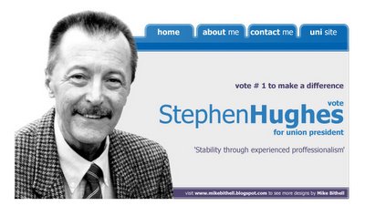
back to my website design roots
well, i'm back to my regular updating patterns.
Today was spent working on the game (more on that later) and the publicity for the university election. I have begun the website for the client, here's a mockup

it uses the university colour scheme, and is clean and simplistic. Can you tell I've been looking at a lot of mac osX stuff recently :)
as for my game work.. here comes a dev diary
Dev Diary: Day 21 - 27/02/2006
Sound work, and a visit from Jules
After recieving a lot of great feedback on the game cutscene from some animators, Jules came round my flat to discuss soundtracks. He had a great mix which he has stitched together from royalty free samples. It really works with the video, so have got to spend some time making it fit with the newspaper footage I have already created.
What was really interesting about the soundtrack was that it blended straight into gameplay, an idea Jules wanted to explore in the visuals too. He suggested that the last frame in the paper should be a gameplay screenshot. After checking with Adam (our engine guy) that it was possible, I suggested the idea of taking that one step further, and actually pushing through the final image into the game, so the faux 3D effect actually ends up being real. If it works it could be a really cool hook.
We also spoke about how the control system for the bike should be introduced, Jules suggested an advert for the bike in the newspaper, which would include keyboard controls, I didnt like it, as I thought it would interfere with the mood of the opening. Instead I suggested an ironic voiceover in the opening.. 'finger print scans show you are borrowing this motorcycle from it's regular owner. Welcome to the electrobike 711, to accelerate press.........'
Jules' girlfriend is canadian.. he reckons she might be able to get the accent just 'have a nice day' enough to work. It's an idea.. not sure if it will actually be used yet.


1 Comments:
About that website mockup that you made: It looks good, and the links to the other pages are there as well. The optimized design will make the visitor experience a lot easier than having to scroll down to find that "About me" page.
11:31 pm
Post a Comment
<< Home